Design a Website Layout In Photoshop !!!
There are a number of different ways to create Websites. While some may choose to hand draw a concept and then start coding HTML, others may want to take a more graphical approach to the design and layout.
This graphical approach is what I'm here to show you.
So today, I'll explain the design process I go through when a new customer hires me. Being very visual, I find it easier to start with an image when I design a Website, and these are the basic steps I follow:
Note: if you publish this image, all I ask for is a link back to my site
Let's get started!
This is the most critical part of the whole design process. The design of your interface is very important for usability. You've probably heard it a thousand times, but the old saying is true: if your visitors can't find all your content, or they're confused by your layout, they really are only one click away from leaving your site.
Planning Ahead
With any new design, you must plan ahead. This will enable you to adapt to any changes that arise quickly and easily. For example, imagine you wanted to add another section to your Website. Does the navigation of your site allow for this, or will it entail a complete redesign? If you're in the latter category, expect to waste time and money -- resources that can easily be saved if you design your site layout well the first time.
It's important to imagine where you'd like to be in the future. Websites are like any other business: you must change with the times.
Layout
We're going to start with an image that is 740x460 pixels in size. In this space, we need to include the header, navigation and content areas.
Below, you can see a layout image that I created in Photoshop. The dark blue bars at the top and bottom of the page represent where our navigation will be -- this kind of layout is very effective if, for example, you have a lot of content and you like fast loading pages.
After you've created your image in Photoshop, it's time to prepare each section so you can use them in an HTML document. Let's slice it up!
Now, "slicing" means that we'll take your original page layout image, and make smaller individual images out of it, which you can then insert into an HTML table.
You could just use the large image as a page on your Website, and make image maps over the areas that you want to be links. The problem with this solution is that it will take forever to download -- your users won't be impressed!
As you'll see in this example, when you slice up a large image, you have the ability to optimize each section individually to make the total file size smaller. Also, as in this example, some slices are duplicated, so you need to only use one of them, which will in turn make the total file size even smaller. The example image I created for this is only 26.1k. What this means to you is that this page will only take 9 seconds for a person on a 28.8k modem to download. Are you starting to see the benefits?
Here we have our image in Photoshop, prepared for slicing:
881_screen1 (click to view image)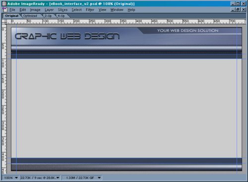
As you can see, blue lines cross the image. These are guidelines that Photoshop allows you to simply drag out of the ruler area -- they mark where we are going to slice the image.
Next, import your image into ImageReady, and select the "Slices" option from the menu. In the drop down menu click "Create Slices from Guides". Your image should look like this:
881_screen2 (click to view image)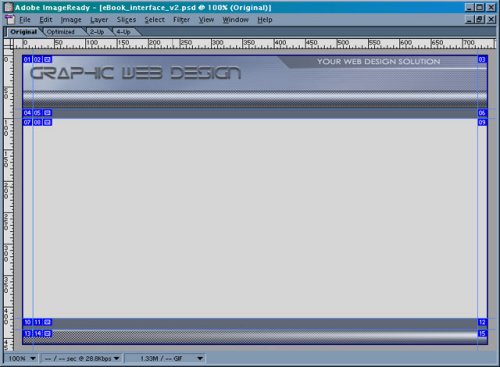
Note that all the slices have been created from the guidelines, and are numbered. The numbers are merely the default method by which ImageReady names the sliced images -- we'll change them later.
Ok, now that you've created your slices, in the "Windows" dialog box choose "Show Slices". It will display something like this:
881_slices_interface (click to view image)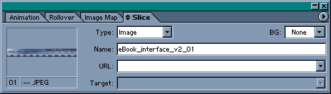
Next, we'll combine some of the slices and name them. So choose the "Slice Selection Tool". The two vertical guidelines have split the header into three images, and we need to combine those slices to make the header into one single image.
Once you've chosen the Slice Selection Tool, click on the top left corner of Slice 01. Then, holding the shift key down, click on Slices 02 and 03. Next, right-click on the center slice, and choose "Combine Slices" from the dialog box that appears. Mac users should choose the Slices menu item and choose "Combine Slices" from the dialog box.
Now your image should look like this:
881_screen4 (click to view image)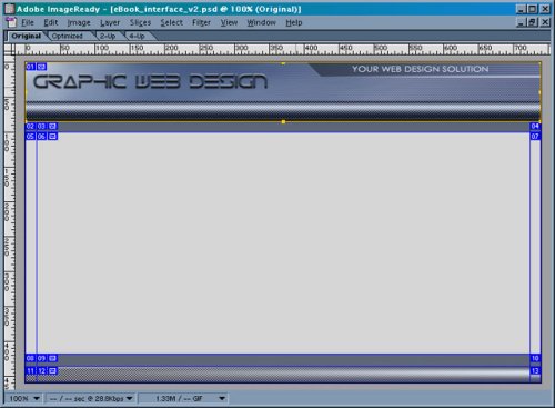
The three slices have now become a single slice, highlighted with a yellow border. To name the slice, go to the "Show Slices" dialog. In the name field type in "header", and repeat this process for the footer area, naming it "footer".
But wait! We still have a few more slices that need names. Just under the header on the left side you should see what is now Slice 02 -- a small, dark blue square. Because this slice has the same dimensions as Slices 04, 08 and 10, we need only save one of them. So click on Slice 02 with the Slice Selection Tool, and name it "blue_square". Next, click on Slice 05 and name it "gray_bar". Again, you'll notice that it is the same as Slice 07 -- so you only need to save one of them.
881_screen5 (click to view image)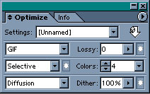
Next, use the "Slice Selection Tool" to select the header, and then, holding down the shift key, click on the footer too. As these slices have complex color transitions it's best to save them as jpegs. Uses these settings:
881_screen6 (click to view image)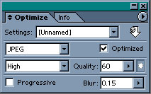
The reason that I've included a small amount of blur here is to smooth out some of the pixelation that's often associated with jpeg images. This is not a common practice when optimizing photographs, however, because the photo will look out of focus.
To export these images use the "Slice Selection Tool" to select the header, footer, blue_square and the gray_bar:
881_screen7 (click to view image)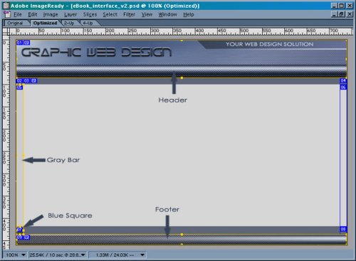
In the File menu choose "Save Optimized As":
881_screen8 (click to view image)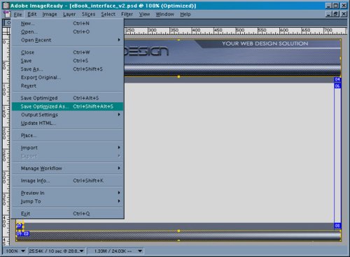
With this, you have a few options:
881_screen9 (click to view image)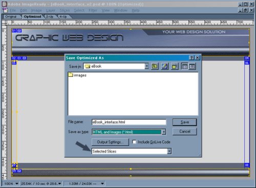
The next step is to create the HTML page we will later use as a template for the rest of the Website. If you're wondering why we didn't save the center slices of our original layout image, here's why. The gray box in the center of the image will contain your content. The blue horizontal bars at top and bottom (ie. below and above the header and footer) similarly serve to designate the location of text links for your navigation.
881_screen10 (click to view image)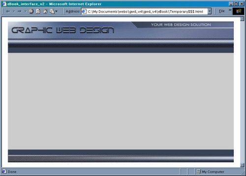 As the page's original white background didn't work well with the design, I created a background image to tile behind the interface.
To make these simple scanlines, create an image in Photoshop that is 1 pixel wide and 2 pixels tall. Select a square that is 1px by 1px and color it to compliment your design. Then, move that selection down, and fill the new square with another color. Save the entire image as a 2-color gif image and name it bg.gif. Simply place this gif in the body tag of your new template, and it will tile across the page. To see the end result, click here.
Notice how the text seems to be indented in the content area, as a result of the placement of the gray_bar image. You will need to change the background color of those cells to the same color (#CCCCCC) as the gray_bar image, so that when the page grows longer, it will still look the same.
To create the space on which the text links are placed, I merely made the background color of that cell in the table the same color as the blue_square image (#374256). The changing color rollover effect on the text links is created with CSS (Cascading Styles Sheets).
This graphical approach is what I'm here to show you.
So today, I'll explain the design process I go through when a new customer hires me. Being very visual, I find it easier to start with an image when I design a Website, and these are the basic steps I follow:
- First, using Photoshop, create an image that mimics the general layout you'd like to use for your site.
- Once you're happy with the image you'll need to "slice" it up for use in your Website template. In this process, it helps to have a working knowledge of HTML. You must know how tables work, so that you can slice your image in a way that will work with tables.
- Then it's time to create an HTML document that's comprised of those slices. This will become the template you'll use to create all the pages of your Website.
Note: if you publish this image, all I ask for is a link back to my site
Let's get started!
Interface Image Creation
Interface DesignThis is the most critical part of the whole design process. The design of your interface is very important for usability. You've probably heard it a thousand times, but the old saying is true: if your visitors can't find all your content, or they're confused by your layout, they really are only one click away from leaving your site.
Planning Ahead
With any new design, you must plan ahead. This will enable you to adapt to any changes that arise quickly and easily. For example, imagine you wanted to add another section to your Website. Does the navigation of your site allow for this, or will it entail a complete redesign? If you're in the latter category, expect to waste time and money -- resources that can easily be saved if you design your site layout well the first time.
It's important to imagine where you'd like to be in the future. Websites are like any other business: you must change with the times.
Layout
We're going to start with an image that is 740x460 pixels in size. In this space, we need to include the header, navigation and content areas.
Below, you can see a layout image that I created in Photoshop. The dark blue bars at the top and bottom of the page represent where our navigation will be -- this kind of layout is very effective if, for example, you have a lot of content and you like fast loading pages.
After you've created your image in Photoshop, it's time to prepare each section so you can use them in an HTML document. Let's slice it up!
Slicing Your Image
Although you can use any graphics software to create your image, I recommend Photoshop. Packaged with this program is ImageReady, which you can use to save images for the Web, create gif animations, and slice up Photoshop images.Now, "slicing" means that we'll take your original page layout image, and make smaller individual images out of it, which you can then insert into an HTML table.
You could just use the large image as a page on your Website, and make image maps over the areas that you want to be links. The problem with this solution is that it will take forever to download -- your users won't be impressed!
As you'll see in this example, when you slice up a large image, you have the ability to optimize each section individually to make the total file size smaller. Also, as in this example, some slices are duplicated, so you need to only use one of them, which will in turn make the total file size even smaller. The example image I created for this is only 26.1k. What this means to you is that this page will only take 9 seconds for a person on a 28.8k modem to download. Are you starting to see the benefits?
Here we have our image in Photoshop, prepared for slicing:
881_screen1 (click to view image)
As you can see, blue lines cross the image. These are guidelines that Photoshop allows you to simply drag out of the ruler area -- they mark where we are going to slice the image.
Next, import your image into ImageReady, and select the "Slices" option from the menu. In the drop down menu click "Create Slices from Guides". Your image should look like this:
881_screen2 (click to view image)
Note that all the slices have been created from the guidelines, and are numbered. The numbers are merely the default method by which ImageReady names the sliced images -- we'll change them later.
Ok, now that you've created your slices, in the "Windows" dialog box choose "Show Slices". It will display something like this:
881_slices_interface (click to view image)
Next, we'll combine some of the slices and name them. So choose the "Slice Selection Tool". The two vertical guidelines have split the header into three images, and we need to combine those slices to make the header into one single image.
Once you've chosen the Slice Selection Tool, click on the top left corner of Slice 01. Then, holding the shift key down, click on Slices 02 and 03. Next, right-click on the center slice, and choose "Combine Slices" from the dialog box that appears. Mac users should choose the Slices menu item and choose "Combine Slices" from the dialog box.
Now your image should look like this:
881_screen4 (click to view image)
The three slices have now become a single slice, highlighted with a yellow border. To name the slice, go to the "Show Slices" dialog. In the name field type in "header", and repeat this process for the footer area, naming it "footer".
But wait! We still have a few more slices that need names. Just under the header on the left side you should see what is now Slice 02 -- a small, dark blue square. Because this slice has the same dimensions as Slices 04, 08 and 10, we need only save one of them. So click on Slice 02 with the Slice Selection Tool, and name it "blue_square". Next, click on Slice 05 and name it "gray_bar". Again, you'll notice that it is the same as Slice 07 -- so you only need to save one of them.
Optimizing and Exporting
We are now going to optimize and export each slice. Use the "Slice Selection Tool" to select the slice called gray_bar Now, hold down the shift key, and click the blue_square slice. As these are both single-color images, we can optimize both at the same time. Use these settings to optimize the two slices as gifs:881_screen5 (click to view image)
Next, use the "Slice Selection Tool" to select the header, and then, holding down the shift key, click on the footer too. As these slices have complex color transitions it's best to save them as jpegs. Uses these settings:
881_screen6 (click to view image)
The reason that I've included a small amount of blur here is to smooth out some of the pixelation that's often associated with jpeg images. This is not a common practice when optimizing photographs, however, because the photo will look out of focus.
To export these images use the "Slice Selection Tool" to select the header, footer, blue_square and the gray_bar:
881_screen7 (click to view image)
In the File menu choose "Save Optimized As":
881_screen8 (click to view image)
With this, you have a few options:
- you can choose the destination (where the images and code will be saved) and then click save, or
- you can choose to save the HTML only, and it will create an HTML page that will fit the layout you designed.
- The third option -- saving only the images we've selected -- is what we are going to do.
881_screen9 (click to view image)
The next step is to create the HTML page we will later use as a template for the rest of the Website. If you're wondering why we didn't save the center slices of our original layout image, here's why. The gray box in the center of the image will contain your content. The blue horizontal bars at top and bottom (ie. below and above the header and footer) similarly serve to designate the location of text links for your navigation.
Putting It All Together
Now it's time to put all the images we just sliced up into an HTML document, to create our page template.- Create a table that has 5 rows and 3 columns. Be sure to place the
tag before the table and the tag after the table, to make sure it's centered on the page. - Then, in the top row, make the first cell on the left col span 3, so you can place the header.jpg image inside that cell. This will also establish the width of the template.
- In the row below the header, make each cell's row height 18 pixels, to correspond with the blue_square.gif image, and make the cells' width 16 pixels. Do the same for the fourth row.
- Now, place the blue_square.gif image in the outer cells of the second and fourth rows. Place the image gray_bar.gif into the first cell (to the left) of the third row, and repeat this step for the third column.
- Set the background colors of both cells to #CCCCCC. Set the second column in the second and fourth rows' background color to #374256. Give the center column in the third row (where your content will be located) a background color of #CCCCCC.
- In the fifth row, choose the first cell and make it col span 3, so that you can place footer.jpg in it.
- Lastly, be sure to specify the row height of the first, second, fourth and fifth rows, leaving the third row unspecified, so it can grow with your content.
881_screen10 (click to view image)
As the page's original white background didn't work well with the design, I created a background image to tile behind the interface.To make these simple scanlines, create an image in Photoshop that is 1 pixel wide and 2 pixels tall. Select a square that is 1px by 1px and color it to compliment your design. Then, move that selection down, and fill the new square with another color. Save the entire image as a 2-color gif image and name it bg.gif. Simply place this gif in the body tag of your new template, and it will tile across the page. To see the end result, click here.
Notice how the text seems to be indented in the content area, as a result of the placement of the gray_bar image. You will need to change the background color of those cells to the same color (#CCCCCC) as the gray_bar image, so that when the page grows longer, it will still look the same.
To create the space on which the text links are placed, I merely made the background color of that cell in the table the same color as the blue_square image (#374256). The changing color rollover effect on the text links is created with CSS (Cascading Styles Sheets).


